Why App Homepages Drive Revenue: What Actually Changes for Restaurant Operators
Connexup Team
Apr 10, 2026
Most restaurant apps have a homepage. What matters is whether it changes ordering behavior in a measurable way. This is where many discussions stop too early.
1. What the Homepage Actually Influences
In restaurant apps, the homepage sits directly in front of three outcomes:
How quickly a user places an order
What they choose to order
How often they come back
Users typically don’t explore multiple layers.
They act on what’s immediately visible.
That makes the homepage less about layout, and more about which actions are made easy.
2. What This Looks Like in Practice
Large brands have already adjusted their apps in this direction.
McDonald's
Simplified ordering paths
Clear entry points to start an order
Unified flows across pickup, delivery, and drive-thru
Reported results:
$18B in digital sales (2021)
25%+ of sales from digital in major markets
(Source: McDonald’s investor reports)
What changed was not just the interface, but how quickly users could move from opening the app to completing an order.
Starbucks
Reorder placed at the front of the experience
Loyalty system integrated into the first screen
Mobile order & pay tightly connected to homepage actions
Reported results:
30M+ active loyalty members in the U.S.
Mobile ordering as a major share of transactions
(Source: Starbucks earnings reports)
The homepage supports repeat behavior by reducing the effort required each time.
Industry signal
According to the National Restaurant Association:
Digital orders tend to produce higher average checks
Item placement and recommendations influence what customers add
The homepage is one of the first places where that influence happens.
3. What Smaller Operators Can Actually Do
The gap is not awareness. It’s execution.
Most restaurant teams don’t control their homepage at this level because:
Changes require app updates
Content is fixed after release
Promotions are hard to reposition quickly
That leads to a common pattern:
Campaign launches → homepage unchanged
New items added → buried in menus
High-margin items → no additional visibility
4. A Practical Way to Think About Homepage Changes
Instead of redesigning everything, changes usually fall into a few controllable areas:
1) Entry points to order
This is about how quickly a user can start an order after opening the app.
Common patterns:
A primary “Start Order” button placed in the first screen view
Clear options for pickup, delivery, or dine-in upfront
A dedicated “Reorder” shortcut for returning users
What often slows users down:
Entry points hidden behind menus
Too many equal-weight options competing for attention
Forcing users to reselect store or fulfillment method every time
What tends to work better:
One dominant action (start order)
Secondary shortcut (reorder last purchase)
Minimal decisions before entering the menu
This reduces the number of steps between opening the app and seeing actual food items.
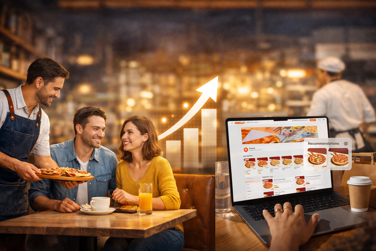
2) What gets surfaced first
The first screen defines what most users will consider ordering.
Common approaches:
Highlighting bestsellers or popular items
Featuring bundles or combo meals
Placing high-margin items in early positions
Where many apps fall short:
New or strategic items placed deep in category pages
Promotions pushed, but not tied to actual menu items
No clear hierarchy between sections
What tends to work better:
1–2 focused sections instead of multiple competing blocks
Direct links from banners to orderable items
Visual priority given to items that drive either margin or volume
This is less about variety, more about controlled visibility.
3) Timing and context
User intent changes throughout the day.
Static homepages ignore that.
Examples of variation:
Morning: coffee, breakfast bundles
Lunch: quick combos, limited-time offers
Evening: family meals, higher-value orders
What often happens instead:
Same homepage shown all day
Promotions not aligned with time-based demand
No adjustment for weekday vs weekend patterns
What tends to work better:
Time-based content switching (automatic or scheduled)
Different featured items for different dayparts
Aligning promotions with when users are most likely to convert
This reduces mismatch between what users want and what they see.
4) Repeat behavior
Returning users are usually the highest-value segment.
The homepage can either support that behavior or reset it every time.
Common patterns:
“Order Again” or “Recent Orders” modules
Saved preferences (location, payment, favorites)
Loyalty or rewards visibility
What creates friction:
Users needing to rebuild the same order repeatedly
No visibility into past behavior
Rewards hidden in separate sections
What tends to work better:
One-tap access to previous orders
Persistent user context (store, preferences)
Clear incentives to return (points, offers, progress)
This reduces effort and increases the likelihood of repeat purchases.
These changes are incremental, not structural.
But they tend to influence:
How fast users move
What they choose
Whether they come back
Which is where most of the revenue impact comes from.
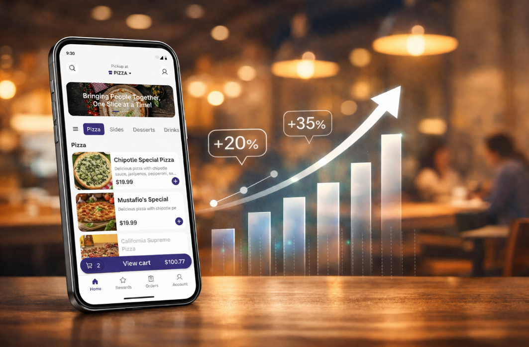
5. What to Expect If You Change It
Typical impact areas (based on industry patterns):
Faster order completion → higher conversion
Better placement → higher average order value
Easier repeat flow → higher return frequency
Time to see changes depends on traffic volume, but in most cases:
Directional signals appear within days
Reliable trends emerge over a few weeks
6. Where Risk Comes From
Homepage changes are not neutral.
The risk is not just what you change, but whether you can adjust fast enough after the change.
Possible downsides:
Too many elements competing → lower conversion
Over-prioritizing promotions → reduced margins
Poor placement → confusion or drop-off
These risks are manageable — if changes can be quickly tested and reversed.
In reality, this is where most teams get stuck.
Even when the right changes are clear, execution is constrained by:
App release cycles
Engineering dependency
Lack of testing capability
So the homepage becomes static, while the business keeps changing.
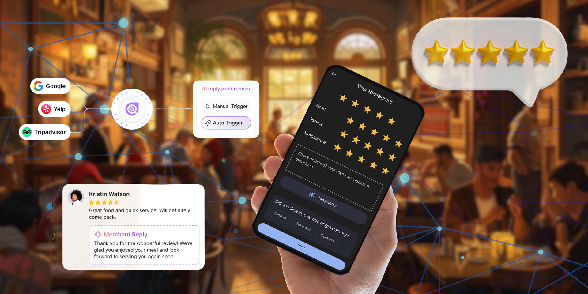
7. Operating Beyond These Limits — Connexup
For many restaurant teams, the limitation is not knowing what to change. It’s being able to make those changes in a timely and controlled way.
Connexup’s Mobile App is designed around this operational gap — turning the homepage into something that can be actively managed.
Instead of a fixed layout, it works as an adjustable layer:
Homepage sections can be updated without rebuilding the app
Promotions, items, and entry points can be repositioned based on current priorities
Ordering flows, campaigns, and loyalty features operate within one system
This allows teams to:
Change what users see first
Align the homepage with daily operations
Connect ordering behavior with repeat incentives
Test and adjust without waiting on development cycles
The homepage becomes part of ongoing operations, rather than something that is set once and left unchanged.
Connexup is built around this exact need—bringing homepage changes into the pace of daily operations, instead of relying on release cycles. To learn more about the product or see how it works in practice, use the contact option below.